Advertising Design in 2026: How to Create Ads That Truly Convert
Users decide in under 2 seconds whether to keep scrolling. This guide breaks down advertising design principles that increase clicks and conversions, including visual hierarchy, contrast, mobile optimization, brand consistency, and proven layout structures that drive measurable results.


Ad design isn’t just about good looks. It’s about grabbing attention fast, building a connection, and getting people to act, all in a matter of seconds.
In 2026, the most effective ads blend clean visuals, bold messages, and layouts that follow how people actually browse and scroll. Whether you’re building social ads, banners, or display campaigns, smart design helps your brand break through the noise.
Here’s everything you need to know to master ad design, with clear principles, real examples, and smart tools.
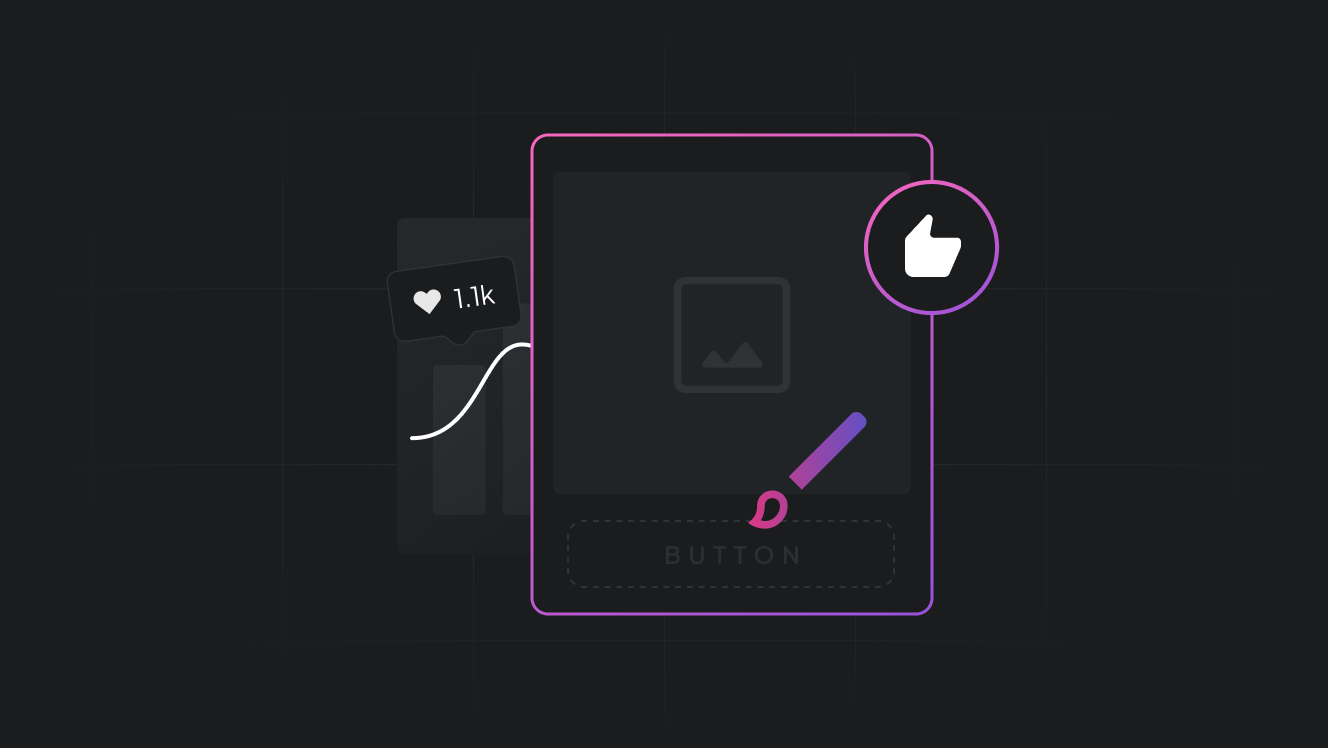
What is Advertising design?
Advertising design is the visual and creative structure of your marketing message. It includes layout, color, font, images, and how everything works together to drive action.
Good ad design doesn’t just show your product — it guides the viewer, tells a story, and makes your message stick. It’s less about decoration and more about clear, emotional communication.
- Clarity first
Your message should be understood in the first two seconds. No one reads long paragraphs or dense text in an ad. Use large, legible fonts and short, punchy copy. And put the benefit up front.
Tip: Use a hierarchy of font sizes and a single, standout headline, smaller supporting text, and a bold CTA to grab attention quickly.
- Strong visual hierarchy
Guide your audience’s eyes from the most important element (like a discount or benefit) to the next. A clear visual order keeps people from feeling overwhelmed and ensures your CTA is noticed.
Example: Create vertical video ads where the headline appears first, followed by a product demo, and then a clear call to action like "Try it free."
- Brand consistency
Every ad reflects your brand. Fonts, colors, and tone, keep them consistent. Use the same color palette across ads. Stick with 1–2 fonts. Keep messages aligned.
You can try a design style guide like Cropink that helps to automate this by letting you lock brand colors, fonts, and logos across all your ad creatives.
- Contrast that pops
Without contrast, even the best-designed ad can go unnoticed. Use light text on dark backgrounds or pair bold colors with white space to guide attention.
Use contrast to highlight CTAs, key offers, or new product announcements. This ensures they don't get buried visually.
- Mobile-optimized design
Did you know that in 2024, mobile represented about 65% of all digital ad expenditure? It shows how advertisers follow the audience. You need to make your designs responsive, fast-loading, and vertically formatted too.
Keep essential content in the center. Avoid tiny text. Test your ads in mobile previews before launching.
Ad design examples that work
Apple: Minimal but impactful
Apple often uses empty space, sleek product photography, and minimal copy. It reflects simplicity and innovation, core brand values.
Nike: Emotional visual storytelling
Nike ads show powerful human moments. Like a runner crossing the finish line, or a teen discovering self-confidence. Their design supports the emotion.
Glossier: Soft yet distinct
Pastels, real skin, UGC photos, all with a minimalist layout. Their design language says, “relatable beauty” loud and clear.
Common ad design mistakes to avoid
Too much text
The rule of thumb? 20% or less of the ad space should be text. Let visuals do the heavy lifting.
Low-quality images
Always use high-resolution product shots. Blurry photos make your brand look unprofessional.
Inconsistent style
Random fonts and colors confuse the audience. Align all creatives with your brand voice.
Tools to design better ads (even without a designer)
Cropink also integrates with your product feed, which means you can create dozens of dynamic ad variations in minutes.
Tips to improve ad design performance
- Place CTAs where eyes land naturally, often in the lower third
- Use lifestyle images instead of plain product shots for better relatability
- A/B test colors, text alignment, and CTA styles
- Stick to two fonts max per ad for a cleaner look
- Add movement or animation for short-form video formats
Final thoughts
In 2026, winning ad design isn’t about being flashy. It’s about being focused. It’s about knowing what grabs people and what guides them to act.
Whether you sell candles or cars, the right layout and message can change everything. And with the right tools, even small teams can create scroll-stopping ads that look like they came from a top agency.
FAQs
It’s the creative layout of an ad- using visuals, text, and color — to communicate a message clearly and persuasively.
Keep the message simple, use contrast and clean visuals, optimize for mobile, and always test variations.
Absolutely. With shrinking attention spans and ad fatigue, good design is what keeps people engaged and helps your brand stay memorable.
Yes. Tools like Cropink make it easy to design branded ads using your product feed. Canva and Figma are also great for beginners.
Source
- Datareportal.com. Digital 2025: global advertising trends
Manisha is a Data-Driven Marketing Expert who turns numbers into narratives and ad clicks into conversions. With a passion for performance marketing and a sharp eye for analytics, she helps brands cut through the noise and maximize their impact in the digital space.
Leszek is the Digital Growth Manager at Feedink & Cropink, specializing in organic growth for eCommerce and SaaS companies. His background includes roles at Poland's largest accommodation portal and FT1000 companies, with his work featured in Forbes, Inc., Business Insider, Fast Company, Entrepreneur, BBC, and TechRepublic.
Related Articles


How Can Cropink Help?
Start with Cropink is easy and free
No credit card required