1:1 Aspect Ratio: Square Format Guide for Social Media & Ads [2026]
Learn how the 1:1 aspect ratio works, when to use it, and why it still performs in social media ads. Includes sizes, examples, templates, and best practices.


Scroll through any social feed and you will notice a pattern. Not every ad tries to take over the whole screen. Many of them sit cleanly in the center. Balanced. Easy to process.
That is the 1:1 aspect ratio.
At first, it looks simple. But there is a reason brands still rely on it, even with vertical formats taking over.
Here is the real question. Should you still use Square Ads in 2026? Or should you move fully to vertical formats?
The answer is not either-or. It is about knowing when square works better and how to use it properly.
Key takeaways
- 1:1 is a square format. It works well across platforms.
- It is best for feed ads and product-focused creatives.
- It is easy to scale and reuse across campaigns.
- It does not grab as much attention as vertical formats.
- Simple, clear designs perform best in this format.
What is the 1:1 aspect ratio?
The 1:1 aspect ratio means your visual has equal width and height. It forms a perfect square.
Common sizes include:
- 1080 × 1080
- 1200 × 1200
- 2048 × 2048
The shape stays the same. Only the resolution changes. This symmetry makes it one of the easiest formats to design and reuse.
Why square ads became so popular
Square ads solved a real problem for marketers.
They work on both desktop and mobile. They look clean in feeds. And they do not require heavy resizing for every platform.
This made them the default format for years.
Even today, they still offer something valuable. Stability. You know your creation will look acceptable almost everywhere.
Where 1:1 works best today
Social media feeds
Square ads fit naturally into scrolling feeds. They do not feel aggressive. They blend in, which often improves engagement.
If your goal is consistent performance across platforms, this is a safe format.
Product-focused ads
When your goal is to sell a product, clarity matters more than creativity.
Square ads help you:
- Center the product
- Show details clearly
- Add minimal messaging
This is why many e-commerce brands still rely on square creatives for catalog ads and retargeting.
Multi-platform campaigns
If you run campaigns across Facebook, Instagram, and LinkedIn, Square saves time.
You can reuse creatives without redesigning everything.
That alone makes it valuable at scale.
Where 1:1 falls short
Let’s be honest. Square is not the most attention-grabbing format anymore.
Vertical formats like 4:5 and 9:16 take up more screen space. That means they naturally get more attention.
Also, square does not work well in Stories or Reels. It leaves empty space and breaks the experience.
So if your strategy is mobile-first and attention-driven, square should not be your only format.
1:1 vs 4:5 vs 9:16 (what actually performs better?)
| Aspect Ratio | Screen Coverage | Strength |
|---|---|---|
| 1:1 | Medium | Flexibility |
| 4:5 | High | Attention |
| 9:16 | Full | Immersion |
Here is how to think about it:
- Use 1:1 when you want consistency
- Use 4:5 when you want visibility
- Use 9:16 when you want full attention
Smart brands test all three.
Real ad examples (How brands actually use square ads)
This is where things get practical.
E-commerce retargeting ads
You will often see a square carousel showing recently viewed products.
Each card shows:
- Product image
- Price
- Minimal text
It works because the user already knows the product. The ad simply reminds them.
Skincare product ads
A single product is placed in the center. Clean background. One benefit.
No noise. No confusion.
This works because clarity wins over creativity in product ads.
SaaS ads
A simple UI screenshot. One line of value.
Square format keeps everything focused. Nothing feels stretched or lost.
Fashion ads
A mix of lifestyle and product.
Half inspiration. Half clarity.
The square layout keeps both elements balanced.
Ready-to-use creative templates
If you want results faster, do not start from scratch. Use proven layouts.
1. Center product layout
Product in the middle. Soft background. Short headline.
Best for: E-commerce
2. Split layout
One side visual. One side product + price.
Best for: Fashion and beauty
3. Offer-based layout
Big discount or message in the center. Product supporting it.
Best for: Sales campaigns
4. Testimonial layout
Short quote. Product below. Clean branding.
Best for: Trust-building
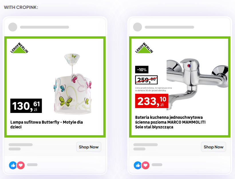
If you manage large catalogs, building these for every product manually becomes slow. This is where Cropink comes in handy. You can apply templates across hundreds of products without redesigning each creative.
Conversion-focused tips (What actually improves results)
Let’s keep this real.
- Show the product immediately: Do not make users think. Show them what you are selling right away.
- Stick to one message: One idea per ad always works better.
- Use price when possible: It filters clicks and improves conversion quality.
- Design for mobile: Even square ads are mostly viewed on phones.
- Test multiple variations: One creative is never enough. Small changes matter.
If you scale it manually, it will take time. That is why performance teams rely on tools like Cropink to generate variations faster and test more angles without extra effort.
Platform Cheat Sheet (1:1)
| Platform | Supports 1:1? | Performance |
|---|---|---|
| Instagram Feed | Yes | Good |
| Facebook Feed | Yes | Good |
| Yes | Strong | |
| TikTok | Limited | Not ideal |
| YouTube | No | Use 16:9 |
Simple rule:
Square works best in feeds. Not in full-screen formats.
Common mistakes to avoid
Most underperforming ads fail because of simple mistakes.
- Too much text
- Too many elements
- Low-quality visuals
- No clear focus
The result is predictable: the user will scroll past.
Choose better formats for your ads:
- 9x16 Aspect Ratio
- 16:9 Aspect Ratio
- 4:5 Aspect Ratio
- Social Media Ads Design
- Dynamic Ads
- Pinterest Dynamic Product Ads 101
Final thoughts
The 1:1 aspect ratio is not outdated. It is reliable.
It may not dominate the screen, but it delivers clarity, consistency, and scale. If you want stable performance across platforms, square is still a strong foundation.
Just do not rely on it alone.
The brands that win are not choosing formats. They are using the right format for the right moment.
FAQs
Vertical ads usually get more attention. Square ads are easier to manage and scale. Most brands use both.
Yes. They still perform well, especially in feed placements and retargeting campaigns.
Yes. They work best for e-commerce, SaaS, and product-focused brands where clarity matters.
Start with 3 to 5 variations. Change visuals, text, or layout. Small changes often improve results.
You can, but you may limit performance. Mixing formats usually gives better results.
My square ads sometimes look cropped because different placements adjust spacing. Keep important elements away from the edges.
Manually, it is slow. Most teams use tools like Cropink to create and update creatives across many products quickly.
Manisha is a Data-Driven Marketing Expert who turns numbers into narratives and ad clicks into conversions. With a passion for performance marketing and a sharp eye for analytics, she helps brands cut through the noise and maximize their impact in the digital space.
Leszek is the Digital Growth Manager at Feedink & Cropink, specializing in organic growth for eCommerce and SaaS companies. His background includes roles at Poland's largest accommodation portal and FT1000 companies, with his work featured in Forbes, Inc., Business Insider, Fast Company, Entrepreneur, BBC, and TechRepublic.
Related Articles


How Can Cropink Help?
Start with Cropink is easy and free
No credit card required