12 Best Facebook Carousel Ad Examples [And Why They Work]
With over three billion monthly active users on Facebook, competition is intense. These 12 Facebook carousel ad examples show how brands capture attention, increase engagement, and drive measurable results in crowded feeds. Learn what works and apply proven structures to your own campaigns.


![12 Best Facebook Carousel Ad Examples [And Why They Work]](https://honest-garden-2954e8e7e9.media.strapiapp.com/Image_Dynamic_Templates_bf76dfd39a.png)
When you advertise on Facebook, you are competing in front of more than three billion monthly active users.
India alone has 378 million users, and the United States, Indonesia, and Brazil each count well over 100 million.
Nearly one fifth of global users are men aged 25 to 34, with women in the same age group close behind.
That scale means attention is limited and competition is intense.
In this article, we break down Facebook carousel ad examples that stand out and explain how brands turn swipes into real business results.
Before launching your campaign, make sure your creatives meet the latest Facebook ad sizes and specs requirements.
Key takeaways
Structure beats volume.
Do not add slides just to make the carousel longer. Each card should have a clear role and move the story forward.
One idea per card.
Keep every slide focused on one message. Avoid crowded design and make the CTA easy to understand.
Design for progression.
Start with a strong hook, build interest in the middle, and end with a clear outcome and action.
What makes a great Facebook carousel ad?
After reviewing dozens of high-performing Facebook carousel ad examples, we see a clear pattern. The best campaigns are not random slides stitched together. Strong Facebook carousel creatives are structured, intentional, and built to guide attention across the full sequence.
Here is what separates average ads from high-performing Facebook carousel ads examples.
1. A strong first card
In any effective Facebook carousel ad, the first slide must stop the scroll. If the opening fails, the rest of the carousel does not matter.
Nike opens with action and energy. Garmin leads with a bold benefit. The lesson is simple: lead with transformation, tension, or a clear promise. When users instantly understand the value, they continue through the Facebook carousel to see the whole picture.
A powerful hook is the foundation of successful Facebook carousel ad examples.
2. A clear narrative structure
A Facebook carousel ad is not a slideshow. It is a sequence.
Airbnb structures the carousel like a virtual tour. GNC moves from problem to solution to proof. In both cases, each card builds logically on the previous one.
The strongest Facebook carousel campaigns follow a simple flow:
Problem → Solution → Benefit → Proof → Action.
When you use Facebook carousel ads this way, users feel momentum instead of confusion.
3. Visual consistency across the carousel
Trust is visual first.
High-performing Facebook carousel ads examples maintain the same color palette, typography, and layout across each card. Shein uses consistent lighting and styling. Abercrombie keeps a refined, neutral aesthetic.
Every card should feel like part of one campaign, not separate posts. Consistency strengthens recognition and improves performance across the carousel.
4. Strategic use of slides
More slides do not mean better results.
Most effective Facebook carousel ad examples use three to five focused slides. BarkBox reveals one product per card. Peloton highlights one feature at a time.
Each card should introduce a new benefit or message. If slides repeat, engagement drops. The goal of the carousel is progression, not overload.
Be intentional with the structure of Facebook carousel ads.
5. A clear call to action
Even strong creative fails without direction.
The final card of the carousel should clearly tell users what to do next. Dyson closes with a specific purchase prompt. MasterClass ends with a direct enrollment CTA.
The best Facebook carousel campaigns use strong verbs and urgency. If someone has swiped through the entire Facebook carousel ad, they are interested. Make the next step obvious.
12 best Facebook carousel ad examples
Below, we break down 12 high-performing Facebook carousel ad examples. Each one follows the same structure so you can clearly see why it works and how to apply the idea to your own campaigns.
Here is what we analyze for every brand:
- Brand
- Campaign goal
- What they did
- Why it works
- Steal this idea
These real-world Facebook examples show how carousel ads on Facebook can move beyond basic product displays and become structured conversion journeys.
1. Gymshark: Panoramic continuity
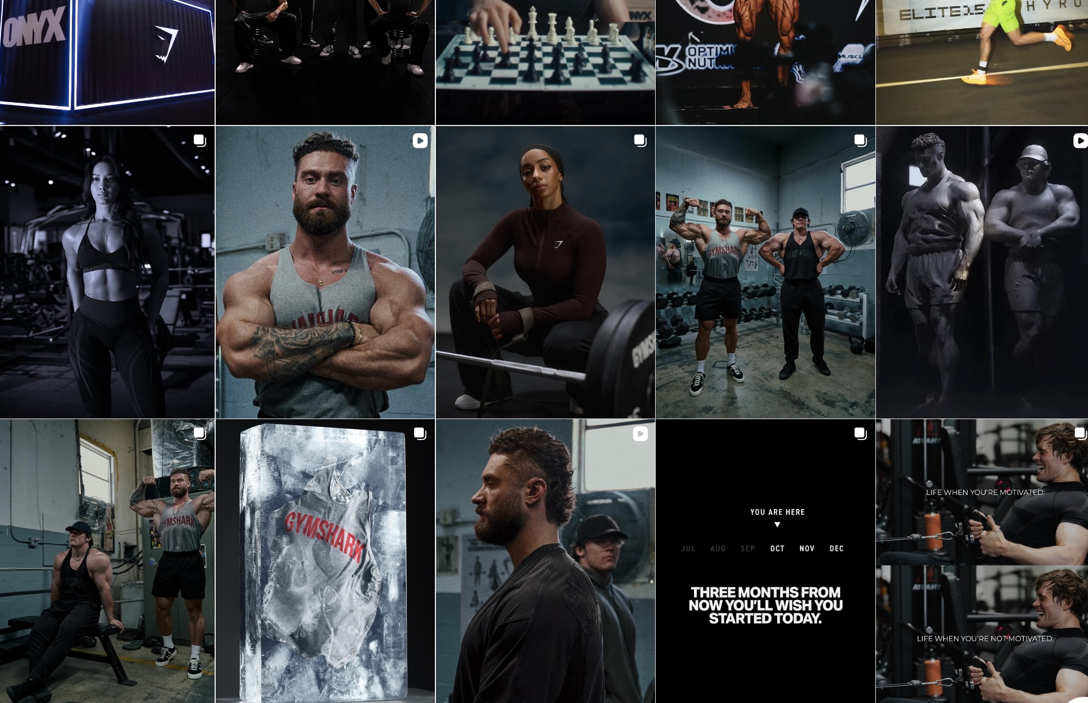
Gymshark is a performance apparel brand targeting fitness-focused audiences. Their creative is bold, minimal, and movement-driven. They rarely overcrowd visuals. In this carousel, they focused on continuity instead of product overload. This is a strong execution of visual sequencing.
- Campaign goal: Increase swipe engagement and showcase multiple outfits in one ad. Drive traffic to collection pages.
- What they did: They split one wide lifestyle image across 4–5 cards. The model’s body continues from one card to the next. The final card links to the product page.
- Why it works: Users instinctively swipe to complete the image. It forces interaction without gimmicks. Engagement increases because curiosity is built into the design.
- Steal this idea: Use one strong visual and divide it intentionally. Do not repeat disconnected images. Tools like Cropink help maintain alignment and brand consistency across every card automatically.
2. Canva: Case study storytelling
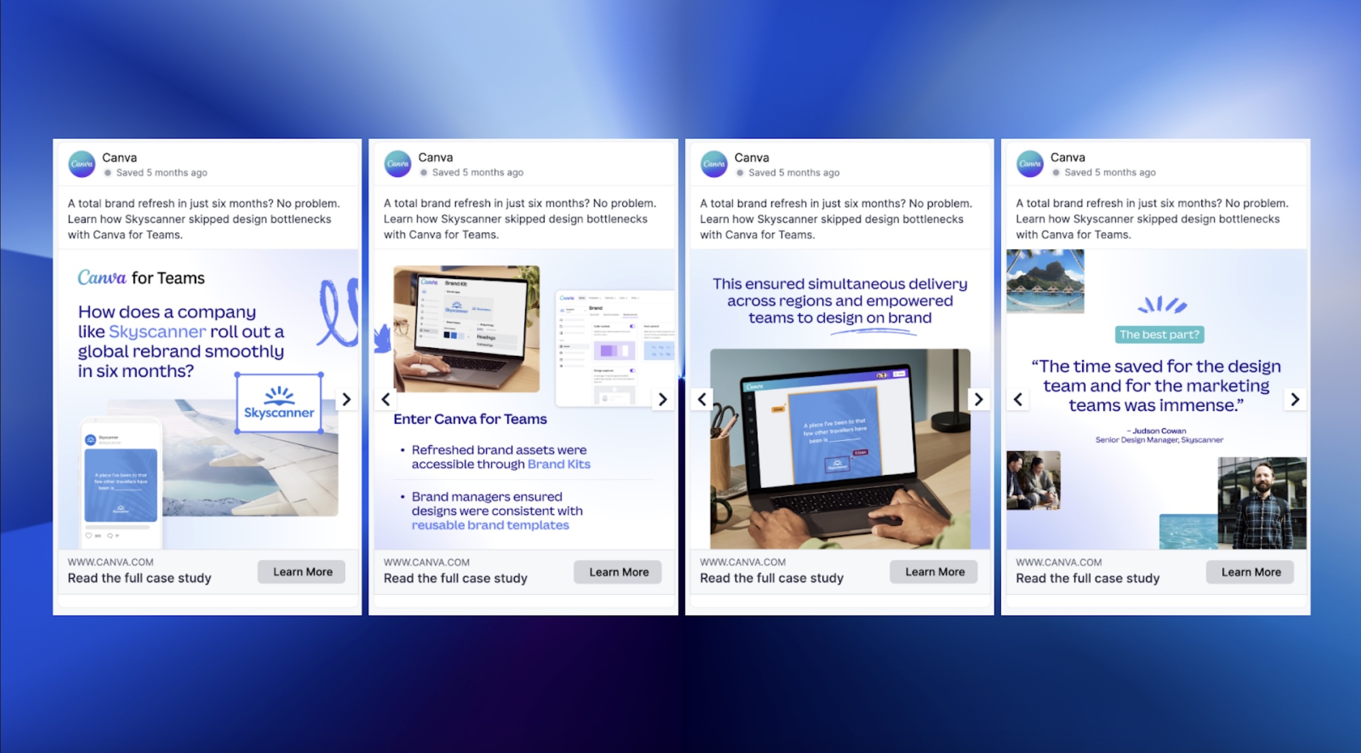
Canva targets business teams and marketers. Their messaging focuses on productivity and collaboration. They simplify complex value propositions. This carousel shows structured B2B storytelling.
- Campaign goal: Generate leads for Canva for Teams. Show real business impact before asking for a signup.
- What they did:
- Card 1: Business challenge.
- Card 2–3: Solution using Canva.
- Card 4: Result and CTA to landing page.
- Why it works: It mirrors decision-making logic. Each slide answers one question. This reduces friction and increases click-through.
- Steal this idea: Turn testimonials into structured sequences. One slide per insight. With Cropink, you can templatize case study layouts and scale them across campaigns.
3. Dyson: Feature demonstration
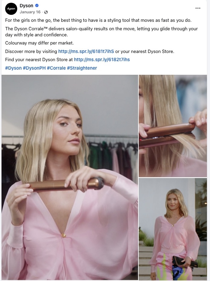
Dyson sells high-priced technology. Buyers need proof before purchasing. Their ads are outcome-focused. They avoid clutter.
- Campaign goal: Justify premium pricing by demonstrating versatility. Drive traffic directly to the product page.
- What they did: Each card highlighted one attachment with a quick demo visual. No feature stacking on one slide. Final card pushes purchase.
- Why it works: It removes uncertainty. Users see real outcomes, not vague claims. Clarity increases conversion probability.
- Steal this idea: One benefit per card. Do not overload. Cropink allows dynamic benefit overlays pulled from product feeds to keep this scalable.
4. Gong: Data teaser strategy
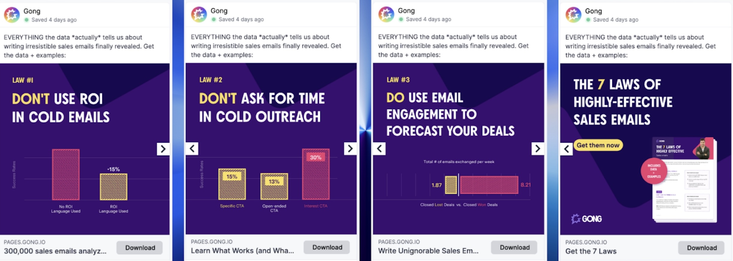
Gong targets sales teams with research-driven messaging. Their strength is data credibility. They focus on insight, not aesthetics.
- Campaign goal: Drive report downloads. Capture qualified leads.
- What they did: Each card revealed one strong statistic. They withheld full context until the landing page. Final slide included a download CTA.
- Why it works: Curiosity gap. Users feel informed but incomplete. That drives clicks.
- Steal this idea: Tease insights, do not explain everything. This works well for SaaS and B2B campaigns.
5. Victoria’s Secret: Layered promotions
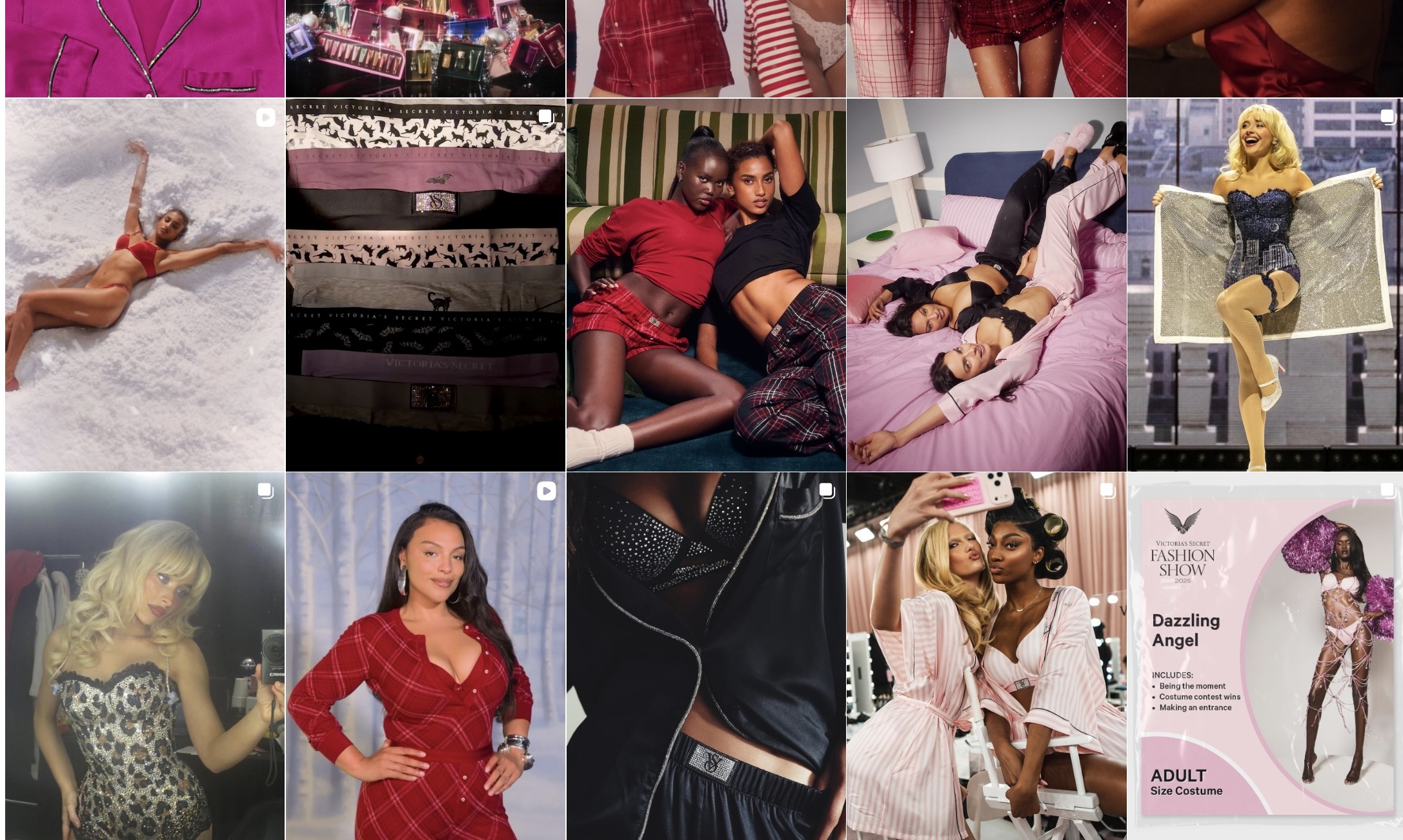
Retail brand with frequent promotional campaigns. Offers often include multiple conditions. Messaging can get cluttered.
- Campaign goal: Explain multi-part discounts clearly. Drive sales during a promotional window.
- What they did:
- Slide 1: Main discount.
- Slide 2: Free gift condition.
- Slide 3: Minimum spend clarification.
- Final slide: Shop now CTA to product page.
- Why it works: Each card isolates one message. No cognitive overload. Cleaner ads convert better.
- Steal this idea: If your offer is complex, break it apart. Cropink helps automatically update discount overlays when pricing changes.
6. BarkBox: Humor continuation
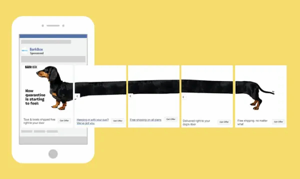
Subscription pet brand with playful branding. Relies on personality. Targets dog owners emotionally.
- Campaign goal: Increase subscriptions and brand recall.
- What they did: Used a long dachshund visually stretched across cards. Each slide continued the joke. Final card pushed subscription.
- Why it works: Humor keeps people swiping. Engagement improves because the content feels entertaining, not sales-driven.
- Steal this idea: Build continuity into visuals. Emotional engagement drives clicks.
7. Shein: Multi-SKU showcase
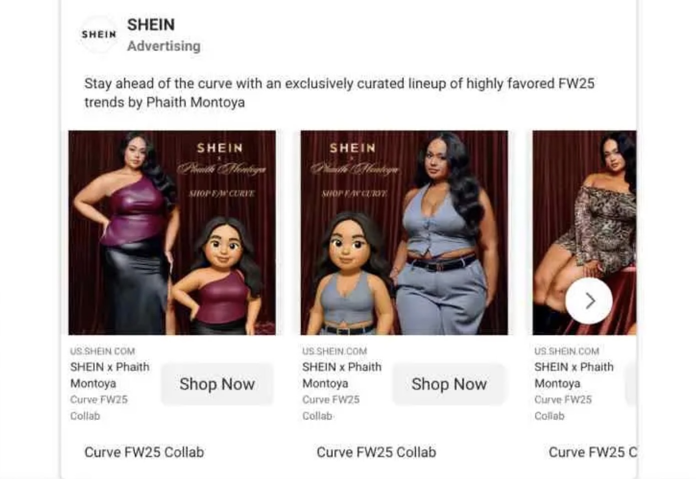
Shein is a fast-fashion ecommerce platform built on volume and speed. They release large numbers of products daily and compete heavily on price. Their audience is accustomed to browsing quickly and comparing multiple options. Their ads reflect that behavior. They rarely rely on deep storytelling.
- Campaign goal: Promote multiple products in a single campaign. Increase direct purchases without sending users through a long funnel. Maximize the chance that at least one product resonates.
- What they did: Each card featured a different outfit with visible pricing and a clear CTA. Every slide linked directly to its own product page. The layout stayed consistent so users could compare quickly.
- Why it works: It mirrors ecommerce browsing behavior. Users scroll, scan, and click what stands out. Instead of forcing one hero product, the ad increases probability by showing variety.
- Steal this idea: Use your carousel as a mini storefront. Feature 4–8 strong SKUs instead of overexplaining one item. With Cropink, you can automatically generate consistent branded creatives across your entire catalog without designing each card manually.
8. Nike: Audience targeting
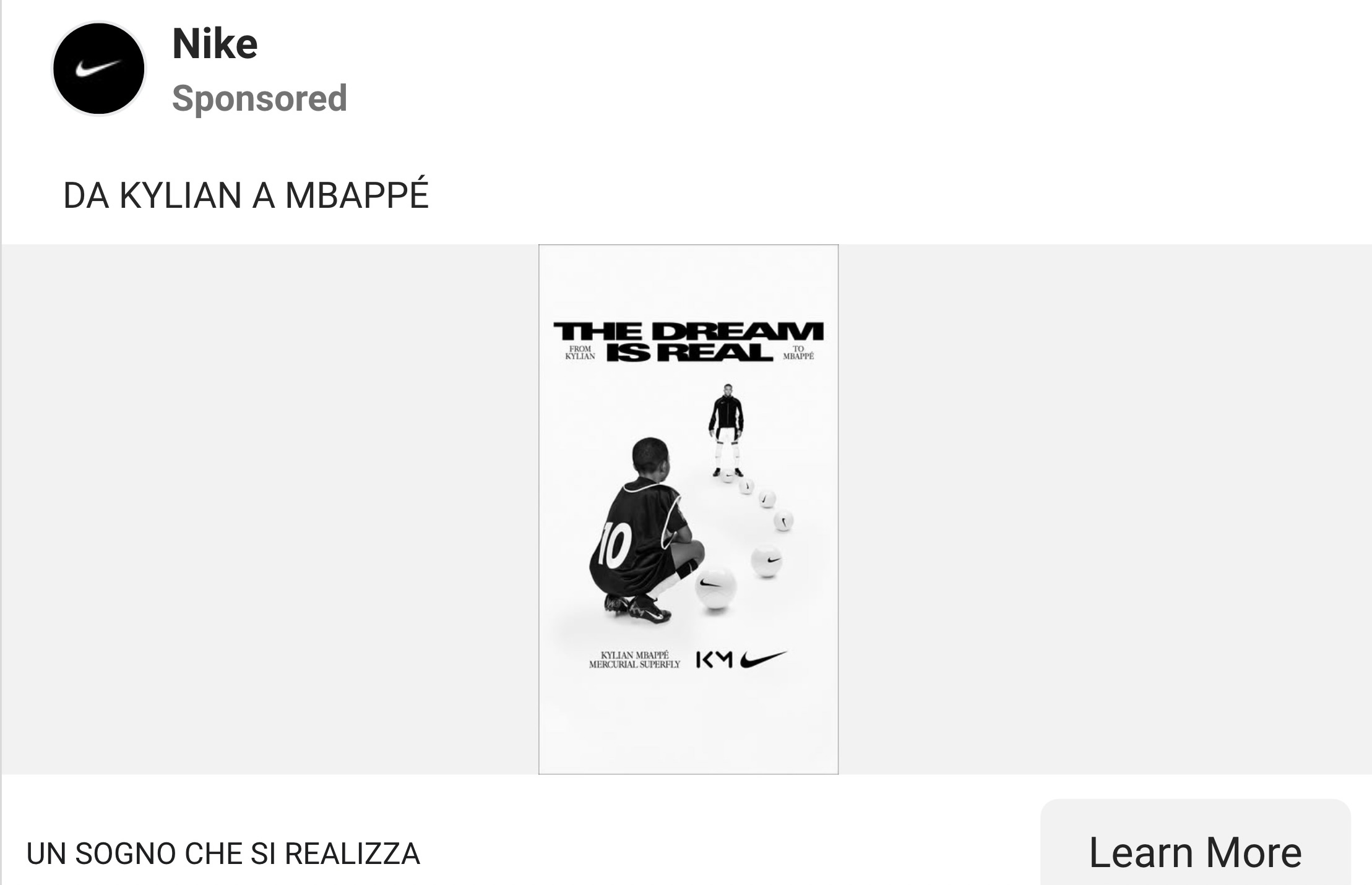
Nike is a master of segmentation. They rarely create generic ads. Each campaign clearly targets a specific persona. In this case, the buyer was parents, not kids.
- Campaign goal: Sell kids’ sportswear while positioning Nike as high-quality and performance-driven. Speak to the real decision-maker.
- What they did: They used action shots of children playing sports. The messaging emphasized durability, comfort, and performance, things parents care about. Multiple styles were shown across slides to reinforce variety.
- Why it works: Relevance increases response. When the messaging aligns directly with the buyer’s priorities, engagement improves. The ad feels personalized instead of broad.
- Steal this idea: Define who actually pays before building the carousel. Align visuals and copy with that mindset. If you’re scaling segmented campaigns, Cropink helps maintain brand consistency while adapting creative to different audience segments.
9. Honest Greens: Menu format
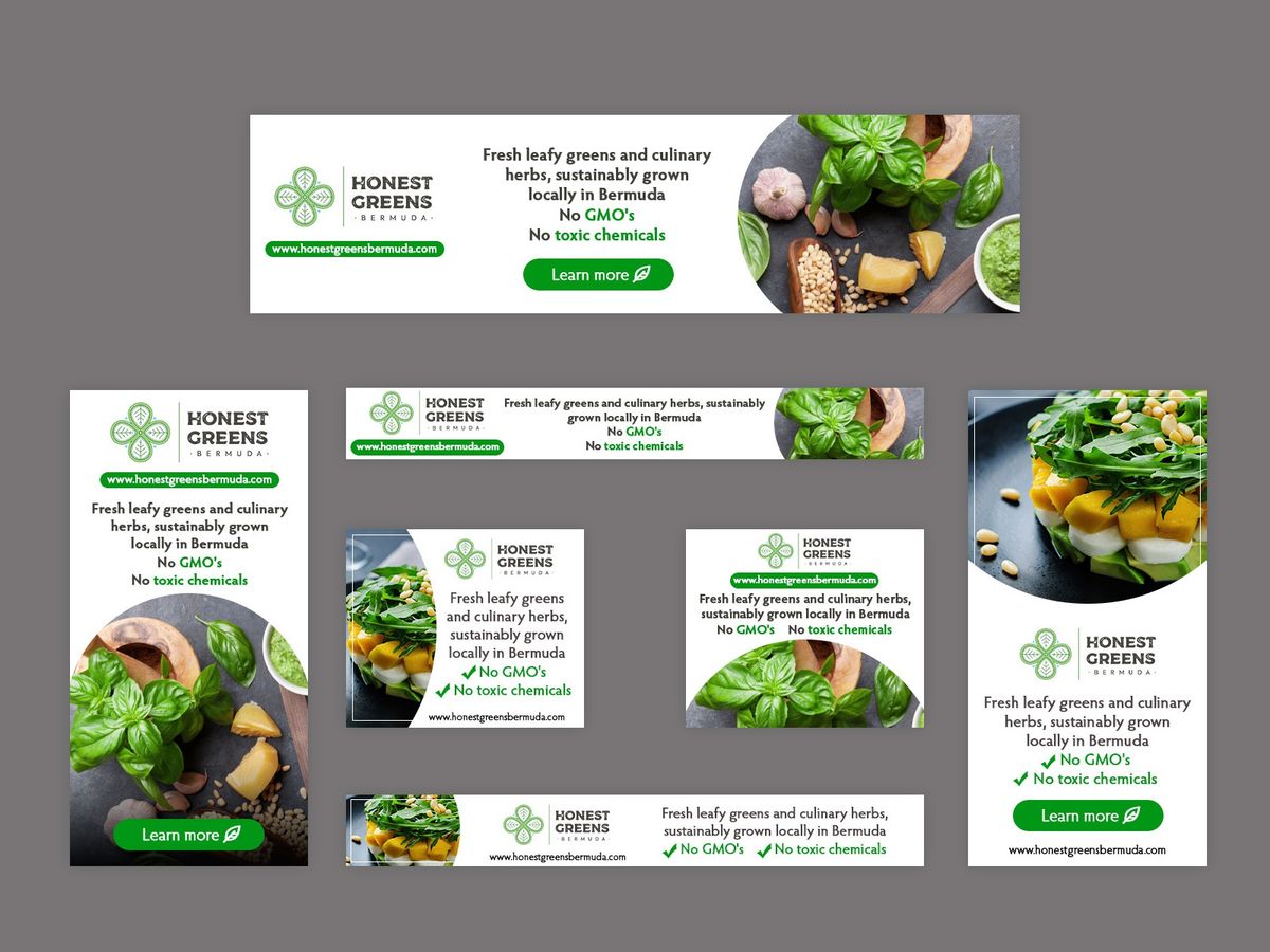
Honest Greens is a restaurant brand selling visually appealing, healthy meals. Food is inherently visual and choice-driven. Customers decide based on what looks appealing.
- Campaign goal: Drive restaurant visits and online orders by showcasing variety. Reduce friction between viewing and ordering.
- What they did: Each card showed one dish with consistent lighting and composition. The styling stayed uniform across slides. The final card included a simple CTA to order.
- Why it works: It mimics how people browse menus. Each slide isolates one option, making decisions easier. Simplicity reduces friction and increases action.
- Steal this idea: If you sell visual items, dedicate one card per offering. Keep layouts consistent so users can compare easily. Tools like Cropink help enforce uniform styling across large sets of visual products.
10. Airbnb: Destination sequence
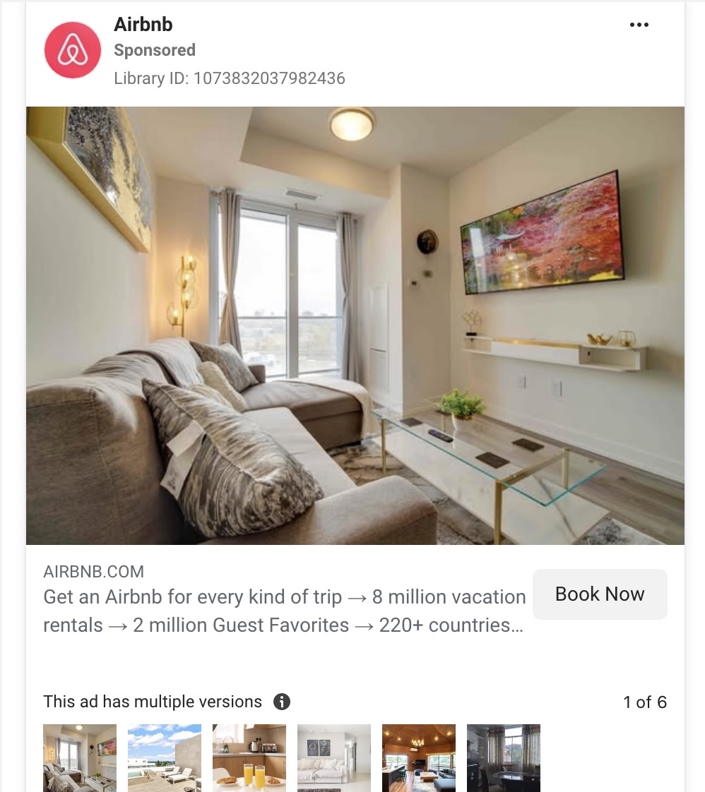
Airbnb sells experiences, not just properties. Booking decisions are emotional. Users imagine themselves in the space before committing.
- Campaign goal: Increase bookings for specific listings or destinations. Build desire before driving traffic.
- What they did: Slide 1 showed the lifestyle atmosphere. Slide 2 highlighted an interior detail. Slide 3 focused on a unique amenity. Final slide pushed a “Book Now” CTA.
- Why it works: Emotion comes first. Details follow. By the time the CTA appears, desire is already built. This reduces resistance and improves conversion likelihood.
- Steal this idea: Structure your carousel as a progression: feeling → feature → benefit → action. If you’re promoting properties or experiences at scale, Cropink can help automate design consistency across multiple campaigns.
11. Sephora: Product education
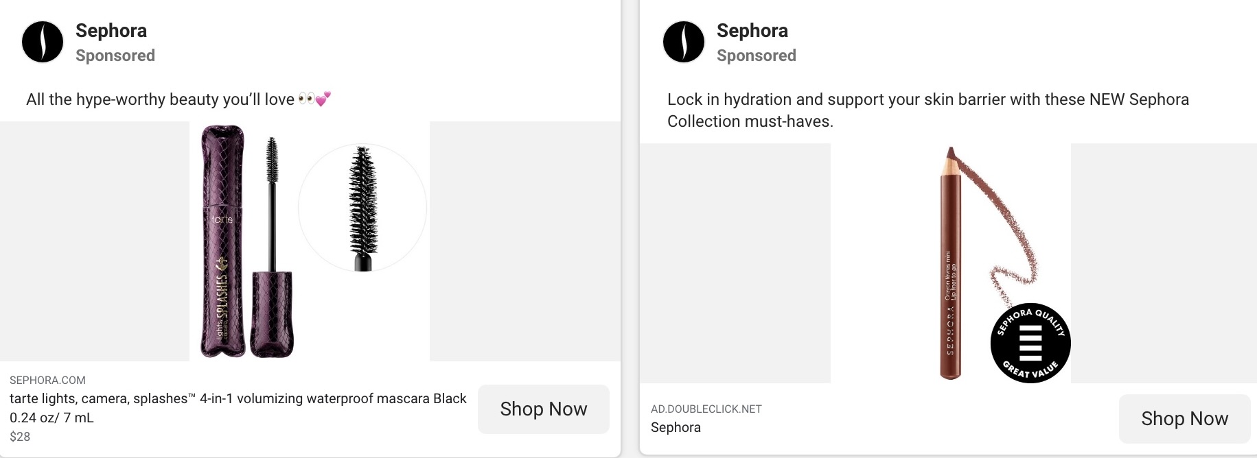
Sephora operates in a category where trust and demonstration matter. Beauty buyers hesitate without seeing proof. Visual clarity directly impacts sales.
- Campaign goal: Reduce uncertainty and increase confidence before purchase. Improve conversion rates on product pages.
- What they did: Slide 1 introduced the product. Slide 2 showed texture. Slide 3 demonstrated application. Slide 4 showed final results. Final slide directed users to the product page.
- Why it works: It answers key buyer questions visually. Users do not need to imagine results, they see them. That reduces friction and builds trust.
- Steal this idea: If your product requires explanation, dedicate one slide per step. Demonstrate outcome clearly. With Cropink, you can overlay benefit callouts like “Before,” “After,” or “Step 1” directly onto visuals without custom design work every time.
12. HubSpot: Feature stack
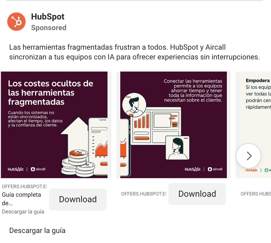
HubSpot sells software with multiple tools and integrations. Overwhelming buyers with everything at once would reduce clarity. Structured messaging is critical.
- Campaign goal: Drive demo bookings by showcasing core platform benefits clearly. Avoid information overload.
- What they did: Each slide focused on one major feature. Layouts remained identical for clarity. The final slide directed users to book a demo.
- Why it works: Clarity improves comprehension. Buyers understand the ecosystem without feeling overwhelmed. Organized information increases trust.
- Steal this idea: Treat each slide as a feature tile. Keep visual hierarchy identical across cards. Cropink templates allow you to maintain consistent layouts across multiple feature-based campaigns.
7 proven carousel ad patterns you can use
At Cropink, we work with 700+ ecommerce brands running dynamic campaigns across Meta. On average, we see 10–15% improvement with always-on campaigns, 25–30% lifts with promos, and up to 3x better results with optimized creative. The takeaway is simple: structure drives performance.
The best brands use Facebook carousel ads with intention. If you want your ads to stand out, these seven patterns consistently deliver results. Below are practical frameworks you can apply to the ad you are building now.
1. The panorama swipe technique
This pattern splits one continuous visual across slides to encourage people to see more.
Airbnb, for example, creates a virtual tour where each card reveals a new room. Users swipe to see the whole space before reaching the booking landing page.
Why it works:
- Builds curiosity
- Connects each card visually
- Encourages people to keep swiping
If your product or service benefits from immersion, this is one of the strongest Facebook examples to model.
2. The problem–solution sequence
This is one of the most effective Facebook carousel ads structures because it mirrors how your audience thinks.
GNC opens with fatigue as the problem, follows with supplements as solutions, adds proof, then directs users to the product page.
Each card moves the ad forward. That progression makes users more likely to convert because the logic feels natural.
Use Facebook carousel ads this way when your product or service solves a clear pain point.
3. The multi-product showcase
If you sell multiple SKUs, this is a practical way to show their products without clutter.
Shein displays different outfits across slides, each linking to its own landing page. Instead of promoting one item, their carousel highlights variety.
Why this works:
- Each card stands alone
- It mirrors online browsing behavior
- It increases the chance something resonates
When you use Facebook carousel ads to showcase collections, your audience can quickly scan options inside one structured ad.
4. The educational explainer format
Some offers require explanation before purchase.
MasterClass previews lessons step by step before pushing enrollment. Each card answers a potential objection, then directs users to the landing page.
This approach adds a personal touch because it feels like guidance, not pressure. It works especially well for software, courses, and premium services.
If your audience needs context, use Facebook carousel ads to educate before you sell.
5. The promotion breakdown structure
Complex offers can overwhelm users in a single ad.
BarkBox simplifies a 50% discount by spreading details across their carousel. One card announces the deal. The next cards show what is included. The final card pushes the offer.
Breaking down promotions this way helps the ad feel clear and intentional. It also ensures your audience understands the value before clicking through to the product page.
6. The feature stack approach
If your product has multiple benefits, isolate them.
Dyson introduces the main tool, then highlights attachments one by one before directing traffic to the landing page.
This format respects design specifications and keeps the ad clean. Each card focuses on one feature, making the product easier to understand.
When brands use Facebook carousel ads like this, they avoid overwhelming users while still showing depth.
7. The teaser-to-download funnel
This works well for apps and digital services.
Peloton previews workouts and transformations before inviting users to start a free trial. Instead of pushing a hard sale, the ad builds aspiration.
That sequencing makes users more likely to click because they feel inspired first.
If your goal is times more traffic to a landing page or app install page, use Facebook carousel ads to warm your audience before asking for commitment.
Common mistakes in Facebook carousel ads
Even the best formats fail when execution is careless. Facebook carousel ads are powerful because they let you sequence multiple images or videos within one unit.
But structure matters. When brands ignore flow, clarity, or intent, the carousel underperforms.
Weak first card
The first card decides whether anyone engages with the carousel.
Many brands treat it like a placeholder. That is a mistake. If the opening slide does not spark curiosity, no one will see the rest of the carousel.
Strong carousel ad examples always start with tension, movement, or a bold benefit. Weak ones start with a logo, a generic product photo, or a vague headline.
Remember, Facebook carousel ads are shown in crowded feeds. If the first slide does not give users a reason to see the next card, the rest of the carousel does not matter.
A simple test: would you stop scrolling for that first frame?
Repeating the same message on every slide
Another common issue in Facebook carousel ads is redundancy.
Brands often duplicate the same headline across every card, just swapping product images. That removes the purpose of the format. If every slide says the same thing, users have no reason to explore the carousel.
The strongest carousel ad examples treat each card as a progression:
- New benefit
- New feature
- New product
- New proof
Each card should add value. If the second and third slides do not expand the message, you are wasting the structure of the carousel.
Carousel ads are meant to guide attention forward, not repeat the same pitch five times.
No logical order
A carousel ad without structure feels random.
Some Facebook carousel ads show a mix of features, testimonials, and pricing in no clear sequence. That forces users to think too hard. Confusion kills momentum.
High-performing carousel ads are intentional. They follow a path:
- Problem
- Solution
- Benefit
- Proof
- Action
When users understand the journey, they stay engaged with the carousel. When the order feels chaotic, drop-off increases quickly.
If you cannot explain the flow of your carousel ad in one sentence, it likely lacks structure.
Overcrowded design
Just because you can add up to ten slides does not mean you should overload them.
Many Facebook carousel ads try to cram too much text, too many icons, or too many offers into each frame. The result feels cluttered and hard to scan.
Carousel ads are most effective when they isolate one idea per slide. One benefit. One product. One message.
This is especially important when showcasing a range of products. If you are presenting multiple items of products in one campaign, keep each card clean and focused. Visual breathing space improves clarity and trust.
Good carousel ad examples look structured and minimal, not chaotic.
No incentive to swipe
The biggest missed opportunity in Facebook carousel ads is failing to motivate action within the sequence.
If users do not feel rewarded for swiping, they stop.
Ask yourself:
- Does each card create curiosity?
- Does it build momentum?
- Does it make people want to see the next card?
Carousel ads are interactive by nature. The format only works if the audience feels that something new is waiting ahead.
Facebook carousel ads are designed for progression. If every slide feels standalone and disconnected, engagement drops.
FAQs
What are carousel ads on Facebook?
A carousel ad on Facebook is a single ad that contains multiple images or videos users can swipe through in their feed. Instead of showing one static visual, the carousel ad format allows you to display different cards within one unit. Each card can have its own headline, link, and action button. Carousel ads on Facebook are commonly used to show different products, highlight features, or tell a step-by-step story.
How to make a good Facebook carousel ad?
To make a good Facebook carousel ad, start with a strong hook on the first card, then guide your audience through a clear sequence. The best Facebook carousel ads use different cards to build momentum, with every card adding new value. Keep the ad focused on one goal, whether that is sales, leads, or traffic to a landing page. Strong visuals, tight copy, and a clear call to action help the ad stand out and get people to move forward.
What do carousel ads look like?
Carousel ads look like a scrollable strip of images or videos inside a single ad unit. Users swipe left or right to see the next card. Each card includes visual content, short text, and a clickable button. Most of the time, brands use the carousel format to show various products, explain benefits, or walk through a process. The layout is consistent, but the creative elements change from card to card.
What is a carousel post example?
A carousel post example could be a fashion brand showcasing five outfits in one single ad, with each card featuring a different product and price. Another example is a software company explaining features step by step. These carousel ad examples show how brands use the carousel format to guide their audience logically instead of cramming everything into one image. Reviewing strong Facebook examples helps you understand what makes the best Facebook carousel campaigns effective.
Craving more Facebook ads insights? Check out these resources:
Final thoughts
Carousel ads work when they are structured with intent. It is not about adding more slides. It is about sequencing images or videos within the ad so each card moves the viewer closer to action. A great Facebook carousel example proves that flow beats clutter every time.
If you are asking what are Facebook carousel ads really for, the answer is clarity and progression. The strongest campaigns guide users step by step instead of overwhelming them.
Review the patterns we covered, pick one, and create carousel tests around it. Measure what drives engagement and conversions.
If you want to build a creative Facebook carousel faster and keep branding consistent at scale, Cropink helps you design, automate, and optimize without rebuilding every ad manually.
Turn plain catalog ads into high-converting carousel campaigns.
Start using Cropink for free and make every slide work harder.
Sources
Ansherina helps brands create powerful digital marketing and performance marketing strategies. With a passion for ad design and audience engagement, she is dedicated to making brands more visible and impactful.
Leszek is the Digital Growth Manager at Feedink & Cropink, specializing in organic growth for eCommerce and SaaS companies. His background includes roles at Poland's largest accommodation portal and FT1000 companies, with his work featured in Forbes, Inc., Business Insider, Fast Company, Entrepreneur, BBC, and TechRepublic.
Related Articles


How Can Cropink Help?
Start with Cropink is easy and free
No credit card required