Gestalt Principles in Advertising: Real-Life Examples
Explore how the Gestalt law influences visuals in real-world ads. Also see examples of how top brands use Gestalt Principles in Advertising to boost recall and make their messages instantly clear.


Every ad you scroll past has about two seconds to make an impression. Two seconds to stop you, communicate the most important information, and make you remember it.
Most ads don't make it.
The ads that do are designed with an understanding of how the human brain processes visuals.
That understanding traces back to research by psychologists Max Wertheimer, Kurt Koffka, and Wolfgang Kohler, who, in 1920s Germany, developed what we now call Gestalt law.
Gestalt theory explains why your eyes group certain elements together, why an incomplete image still makes sense, and why some logos are recognizable at any size or color.
Today we’re taking you behind the scenes of the Gestalt principles top brands use in advertising, with real examples to inspire your own ad design.
Key takeaways
- The brain processes visuals as a whole before it reads individual elements.
- Gestalt principles are not a design theory for its own sake. The world's most recognizable brands use these principles deliberately in every creative decision.
- An incomplete or hidden visual is often more memorable than an obvious one, because the brain remembers what it had to work to find.
- Ads designed using Gestalt principles can stimulate recall, increase engagement, and boost click-through rates.
- The 7 Gestalt principles are Figure-Ground, Similarity, Proximity, Closure, Continuity, Symmetry, and Prägnanz.
What are Gestalt Principles?
Gestalt is a German word that roughly translates to 'whole.'
The theory, developed in 1920s Germany, holds that the human eye processes visual information as a whole rather than as a collection of parts.
If you look at a car, you see the car as a whole, and not a hood, four doors, and an engine.
That instinct is hardwired into every human's brain, and once you know how it works, you can design ads that are compelling and relatable to your audience.
There are 7 main principles under Gestalt's Theory.
1. Figure-Ground
This principle explains how the human eye automatically separates a scene into what's in focus (the figure) and what's in the background (the ground).
Usually, designs that employ this principle will use contrast, shadows, and shapes to guide users to the most important part of a design.
A classic example is Rubin's Vase.
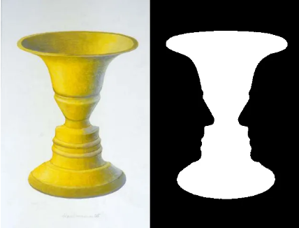
Depending on where your eye lands first, you either see a vase or two faces. Neither reading is wrong since the figure and ground switch depending on what draws your attention.
2. Similarity
This principle explores how elements that share the same color, shape, texture, or font get grouped together in the viewer's mind.
Consistency cues belonging.
This is why a product lineup shot in the same style feels cohesive, and why breaking that pattern with one contrasting element immediately draws the eye.
3. Proximity
Proximity is all about how the brain uses distance as a shortcut for meaning.
When elements sit close to each other, we assume they belong together. This happens because the brain is wired to reduce effort when processing information.
Rather than analyzing each object individually, it quickly groups nearby elements into one unit. That grouping then becomes the message.
In advertising and design, this means placement alone can control how people interpret what they see.
4. Closure
The principle of closure argues that the brain fills in missing information to complete a shape. So if you show someone 80% of a logo, they'll complete the rest themselves.
For example, there’s the use of negative space in the logo below, but your brain is somehow able to complete the shape to form a panda.
![]()
5. Continuity
The continuity principle suggests that the eye follows aligned elements along a path until something interrupts it.
Lines, curves, and flowing shapes pull attention in a direction. Advertisers use this to lead the eye toward a product, a CTA, or a key message without making it feel forced.
![]()
In this Amazon logo, the arrow shows you that the ecommerce platform has all items from A to Z.
6. Symmetry
According to the Gestalt Law, aligned and balanced designs feel resolved and attractive.
7. Prägnanz (Simplicity)
When viewers encounter complex shapes, the eye strips away excess detail and reduces it to the simplest possible form.
This is why iconic logos work at any size, and why an overcrowded ad creative confuses viewers.
How Gestalt Principles influence advertising
Digital ads today have only about two seconds to register before a viewer moves on.
Applying Gestalt principles can help you ensure that viewers understand your message or offer within that window.
The first role these principles play is directing attention instantly.
The human eye does not scan a design randomly. It follows contrast, separates figures from backgrounds, and groups elements automatically.
Advertisers who understand this can control what a viewer sees first without relying on extra copy or explanation.
The second role of the Gestalt principles is building brand recall under limited exposure.
When elements remain consistent in shape, color, and layout, the brain stores them as a single unit.
Even if the viewer only looks for a moment, those patterns begin to register. Over repeated exposure, recognition becomes automatic. That’s how a color, shape, or partial visual can trigger a brand without needing a full logo or message.
The third role that Gestalt principles can play in ads is reducing cognitive effort at speed.
Typically, the brain looks for the fastest way to make sense of what it sees.
Gestalt principles follow that tendency by organizing visuals into simple, predictable patterns.
Ads that follow the Gestalt Law are processed almost instantly, while those that do not are ignored before the message is understood.
11 Gestalt principles examples from real brands
Here are a few examples of how the world's most recognizable brands have used Gestalt principles to make their advertising easier to understand and more memorable.
1. Coca-Cola ad using Figure-Ground
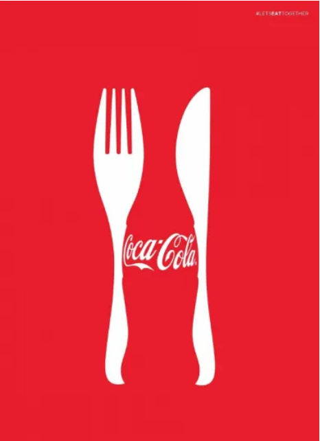
This Coca-Cola ad is a great example of the figure–ground Gestalt principle because it separates what the eye sees as the main subject from the background, then subtly blends the two to create a second meaning.
At first glance, the white shapes read as simple, familiar cutlery against a bold red background.
However, as the viewer looks closer, the negative space between those shapes forms the silhouette of a Coca-Cola bottle.
This change in perception is exactly how figure–ground works: the brain alternates between what it considers the “figure” and the “ground,” allowing both to carry meaning. Instead of placing the product directly, the design lets your brain find it. That subtlety:
- Feels more sophisticated
- Increases engagement because it's clever
- Makes the brand more memorable
This design depends on the figure-ground perception. If you removed that visual illusion, the ad would lose its impact entirely.
2. Coca-Cola ad applying the Proximity principle

In this ad, the bottles are spaced in a deliberate curved arc, and your brain reads that grouping as a smile before it registers the individual objects. That happens automatically.
When elements are placed close together in a pattern, the brain skips analyzing each one separately and jumps straight to the shape they form as a whole.
For Coca-Cola, that shape is the smile the brand has been associated with for decades. The product is both the medium and the message.
3. Heinz Ketchup ad using Closure
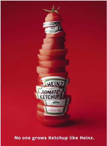
This Heinz ad never shows you a ketchup bottle. Instead, sliced tomatoes are stacked to suggest the bottle's silhouette, and your brain fills in the rest.
That is closure. The shape is incomplete, but your brain does not wait for the missing information. It recognizes the familiar outline and completes it automatically, so you see a ketchup bottle that wasn't there to begin with.
By building the bottle shape from fresh tomatoes, the ad makes a direct argument about ingredient quality without explicitly stating it.
If you're looking for a way to apply the closure principle, cropped product photos are a good start.
In this Cropink template, the watch is deliberately cropped at the edges of the frame. You never see the full product, but your brain fills in the rest and recognizes it as a wristwatch instantly. It's intriguing, but the viewer never has to wonder what the product is.
Try out this free Cropink template to apply the same effect to your own products.

4. Absolut Vodka ad using Figure-Ground
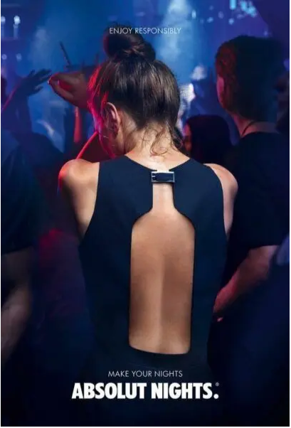
This is a more sophisticated use of figure-ground than the Coca-Cola example.
The bottle is never shown directly. Instead, the cutout on the back of the dress creates a negative space that your brain reads as an Absolut bottle silhouette.
The person is the ground, while the bottle shape is the figure hidden within it.
What makes this ad superb is that the discovery feels accidental.
Your eye lands on the person first, and the bottle reveals itself a beat later. That delayed recognition is intentional.
The product does not need to be front and center to be the image's main point.
5. McDonald's ad using Closure
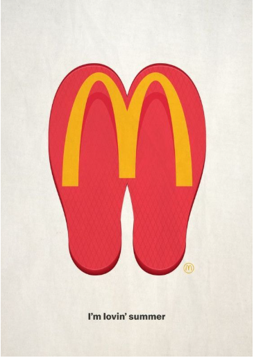
Two flip-flop soles are placed side by side, and your brain bridges the gap between them to complete the "M" on its own.
That is the principle of closure working as it should.
The shape is suggested rather than shown, and your brain fills in the missing details using a logo it has seen thousands of times.
Another interesting thing about the McDonald's ad is that flip-flops are a summer staple, and the tagline 'I'm lovin' summer' reinforces that a Mickey D's would be a perfect summer snack.
6. Essere ad using Continuity
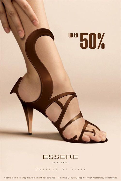
Look closely at the straps on this shoe. They flow across the foot and leg in one continuous path, and when you trace them, they spell out 'S-A-L-E.'
That is the law of continuity. Your eye follows the straps naturally because the brain is wired to track aligned elements along a path. You are not told where to look, but the design just pulls you there.
The result of such a design is an ad where the design and the copy are one and the same. You cannot separate the visual from the message, which is exactly what makes this ad memorable.
7. Nescafé Ad Using Figure-Ground

A clock and a coffee cup do not have much in common, but they share a circular shape. Nescafé uses that overlap to swap one for the space of the other.
In this case, the clock body is the ground, and the coffee is the figure.
Your brain reads the clock first, then registers the coffee sitting where the face should be, and the message is immediately clear: mornings should start with a steaming cup of Nescafé.
8. Nivea ad using the Figure-Ground law of Gestalt
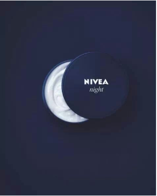
At first glance, this looks like a typical product shot. But the jar is partially cut off at the edge of the frame, and that one detail changes how your brain reads the whole image.
The exposed portion of the jar curves into a crescent. Suddenly, you are not looking at a product against a dark background. You are looking at a moon in the night sky.
The word 'night' appears on the jar, but the image has already told you the most important product information before you read it.
9. Nescafé ad using Similarity
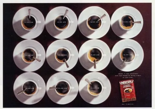
Every cup in this ad is the same shape, the same color, the same size. That consistency is not accidental. It is what makes your brain read 12 individual cups as a single unified grid rather than a collection of separate objects.
The only thing that changes from cup to cup is the angle of the spoon, which doubles as a clock hand showing a different time of day.
The cup-and-spoon arrangement, along with the tagline, communicates that Nescafé is a product that comes through for you at any time of day, whenever you need it.
Because every cup looks identical, your eye moves across the grid effortlessly and reads the progression of time without any friction.
If the cups were all different, the ad would just be full of visual noise.
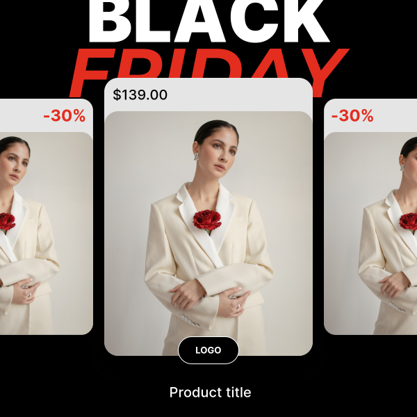
For this fashion ad, three product cards share the same layout, font, and style. Your brain reads them as a single cohesive unit rather than three separate ads, and that consistency is what makes the overall creative feel polished and deliberate.
Try this template to apply the similarity principle to your own product catalog.
10. Coca-Cola ad showing Prägnanz (Simplicity)
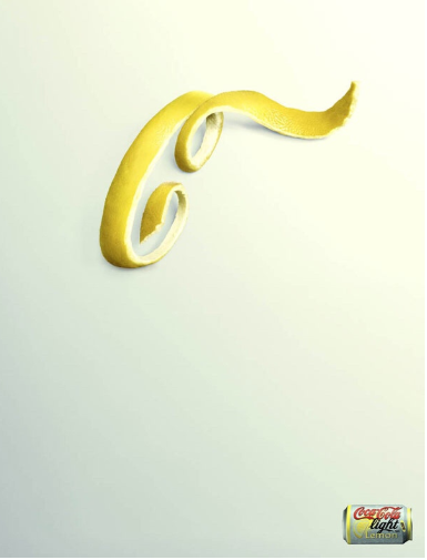
This ad has only three elements: a gradient background, a twisted lemon peel, and a small product shot in the corner. That’s it.
The lemon peel is shaped into the Coca-Cola script ‘C,’ and you can easily guess the flavour of this particular Coke product.
Your brain strips the shape down to its simplest reading, recognizes the letter, and connects it to the brand almost immediately.
That is Prägnanz. The brain always looks for the simplest interpretation of what it sees, and this ad gives it exactly one thing to find.
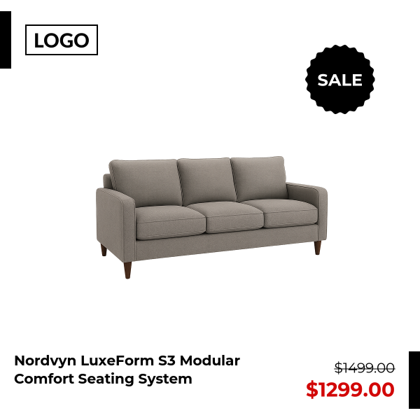
This Cropink template below is a good example of Prägnanz.
The ad only shows you one product, a simple background, the price, and nothing else. Your brain processes it instantly because there is nothing extra to filter out.
11. Cathay Pacific ad using the law of Symmetry

The teacup in this ad is split perfectly down the middle. The left half features a Western floral pattern, and the right half features an Eastern dragon design. There are two cultures, one object, and one vertical line holding them together.
The symmetry here is not just visual balance. It is the message.
Cathay Pacific connects Boston to Hong Kong, and the cup communicates that without needing to explain it.
The tagline ‘Introduce your world to ours’ is almost redundant by the time you read it, because the image has already said it.
Final thoughts on the Gestalt Law
Ad design is a science, and the brands that follow that principle will be able to create the most memorable, compelling ads in their industry.
Of course, you shouldn’t try to fit all Gestalt principles into a single ad creative. The best way to apply the Gestalt law in advertising is to use one principle for each ad design.
If you’re looking to bring these ideas to life in your own campaigns, try out Cropink.com to experiment with layouts, figure-ground effects, and visual hierarchy to create memorable ads like the examples we've just shared.
FAQs
Gestalt principles are a set of rules that explain how the human brain processes visual information as a whole rather than as a sum of individual components.
The 7 Gestalt principles are Figure-Ground, Similarity, Proximity, Closure, Continuity, Symmetry, and Prägnanz. Each one describes a different way the brain organizes what it sees into a coherent whole.
Prägnanz is the principle that the brain always reduces what it sees to the simplest possible form. This is why viewers process minimal designs faster and remember them longer than cluttered ones.
Identify the core message you want to communicate, then choose the principle that best supports that visually, whether that is proximity to group-related elements, closure to let the viewer complete the idea, or figure-ground to guide the eye.
Damaris is a Digital Marketing Specialist who writes about digital marketing and performance marketing. At Cropink, she creates data-driven content to help businesses run better ad campaigns for better performance and ROI.
Leszek is the Digital Growth Manager at Feedink & Cropink, specializing in organic growth for eCommerce and SaaS companies. His background includes roles at Poland's largest accommodation portal and FT1000 companies, with his work featured in Forbes, Inc., Business Insider, Fast Company, Entrepreneur, BBC, and TechRepublic.
Related Articles


How Can Cropink Help?
Start with Cropink is easy and free
No credit card required