What Is Semiotics in Advertising?
Your audience makes up their mind about your brand in just a few seconds, and most of that happens through how they interpret your colors, fonts, images, and cultural references. Read on to find out how semiotics works and how to use it to your advantage.


All elements of an ad campaign are signs.
Your font, color palette, the person in your image, the way they're dressed, and what's behind them, all of it communicates something. Semiotics is the framework for understanding what that meaning is and where it comes from.
As you'll soon discover, semiotics in advertising is about control.
The more deliberately you design meaning into your creatives, the less room there is for your audience to invent meanings you didn't intend.
Read on to learn how semiotics works, why it's consequential for your ads, and how to use semiotics to make more intentional creative decisions.
Key takeaways
- All elements of an ad are signs, and your audience is interpreting them subconsciously.
- Semiotics gives marketers a framework to control the meaning their creative communicates, rather than leaving it to audience interpretation.
- Brands that follow category norms too closely end up communicating the category rather than their own brand.
- A semiotics analysis can help you close the gap between what you think your brand is saying and what your audience is actually hearing.
Semiotics meaning + how it works
Semiotics is the study of signs, symbols, and how people interpret them.
Ferdinand de Saussure, a Swiss linguist, was among the first to formalize the idea. He proposed that every sign has two parts:
- The signifier
- The signified
The signifier is the form the sign takes, whether that is an image, a word, a color, or a sound. The signified is the concept or feeling it triggers in the person receiving it.
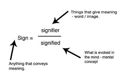
One signifier can also produce multiple signifieds.
For example, the color red can mean urgency on a landing page button, but it can also mean love, danger, or heat depending on the context and the audience reading it.
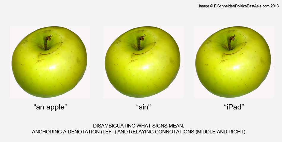
Roland Barthes later built on Saussure's framework and introduced two concepts that are even more useful to marketers: denotation and connotation.
Denotation is the literal meaning of a sign. A man in a suit denotes a person wearing formal clothing.
On the other hand, connotation is the emotional and cultural layer on top of that. That same man in a suit can convey authority, professionalism, or, depending on your audience, detachment.
Both layers are always present in your ads, whether you planned for them or not.
The three types of signs
Charles Sanders Peirce, who developed his theories independently of Saussure, categorized signs into three distinct types.
- Icon. An icon looks like what it represents. In that case, a photo of a burger in a fast food ad is an icon.
- Index. An index is a sign that something exists because of a direct physical connection. You cannot see heat, but you can see steam. The steam is the index.
- Symbol. A symbol carries a meaning learned entirely through culture. A crown symbolizes luxury and royalty, not because of how it looks, but because of what audiences have been conditioned to associate it with over time.
![]()
Codes and conventions
Codes and conventions are signs so widely agreed upon within a culture that audiences process them without thinking.
- A padlock icon means security.
- A checkmark means completion or approval.
- A stethoscope means healthcare.
Importance of semiotics in advertising
Here’s why you need to understand semiotics before you create your next advertisement.
1. Everything communicates
We might sound like a broken record already, but your audience interprets every creative choice as a sign.
Those connotative meanings lodge in their memory and, over time, influence brand preference.
Here's an important question to ask yourself.
Does your brand's visual identity, your name, your color palette, your logo, and your imagery mean what you think they mean?
Are you communicating the right message for every campaign you put out?
Most brands assume the answer is yes until they perform a semiotics analysis for their business.
2. You need to stand out
Knowing that everything communicates is only half the battle. The other half is making sure what you communicate is distinctly yours.
A lot of brands fall into the trap of looking like everyone else.
They follow category norms so closely that their ads eventually look and feel like every other brand in their space.
Semiotics helps brands spot these patterns and break away so they can stand out.
Brands need semiotics because, like people, they have blind spots, they lose their way, and they forget what makes them unique and compelling. Semiotics works through doing deep scientific deep dives into the hard-to-see but critical emerging patterns in culture, to help brands and their brand owners and their agencies create more creative, distinctive communications.

Founder, Creative Semiotics Ltd
3. Risk mitigation and validation
Semiotics is also a risk management tool.
It gives brands a rationale for their creative choices and ensures their design and communication strategies send the right messages to the right audience.
It also helps brands predict what meanings a symbol might accumulate over time, so they are building something with lasting power rather than something that dates quickly or misfires in a different cultural context.
The 4 semiotic levers that impact ads
1. Color
Have you ever asked yourself why Burger King, McDonald's, Wendy’s, and KFC all use variations of red or yellow in their branding?
Red is typically associated with appetite, urgency, and excitement, while yellow is associated with warmth and happiness. Neither of those choices was accidental.
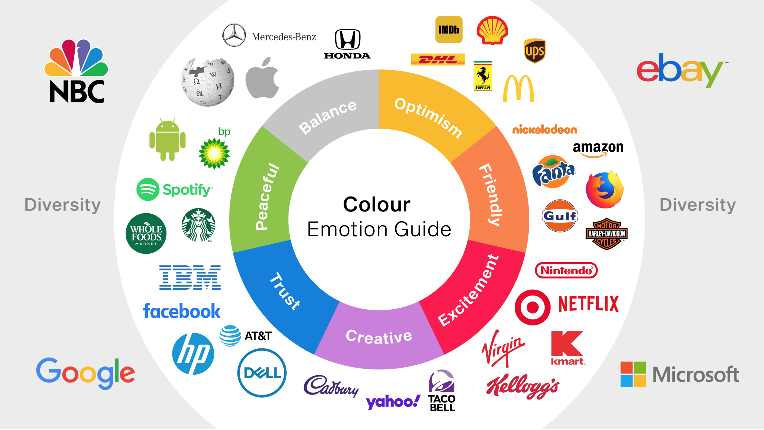
Color is the first thing your audience sees before they read your headline or process your offer. The color palette and its subconscious meanings can completely dictate how a consumer perceives a brand.
According to a study published at the 8th International Joint Conference on Environmental and Light Industry Technologies, the effect of color on purchasing behavior ranges from 80 to 100 percent, depending on the product.
In short, color is a sign, and people interpret it subconsciously before they even think about the product itself.
2. Imagery
The type of imagery you choose tells your audience exactly who you are talking to.
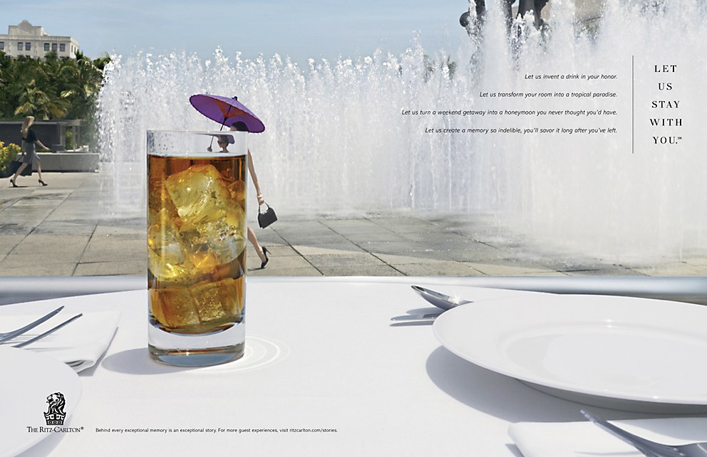
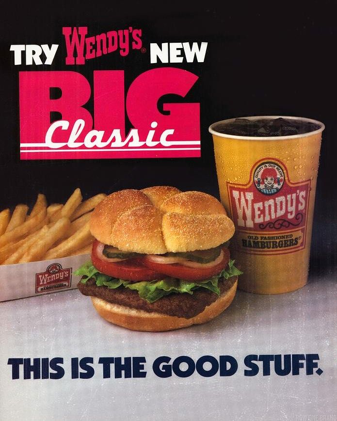
Look at the Ritz-Carlton ad versus the Wendy's ad below. Both sell food and drink, but the images in each convey a different message about who the customer is and how much they are willing to spend.
Ritz-Carlton
Wendy’s
The Ritz-Carlton ad uses minimal, clean visuals, a single drink on a pristine white table, open space, and soft light.
It communicates a premium, design-conscious, and unhurried vibe.
Wendy's, on the other hand, uses bold colors, large fonts, and a busy layout to convey a high-energy, affordable, and built-for-everyone vibe.
The biggest mistake a brand can make is choosing imagery based on what is trending rather than what resonates with its target customer.
3. Cultural codes
You have probably heard this one before.
Pepsi's 1960s slogan "Come Alive! You're in the Pepsi Generation" was reportedly translated in China as "Pepsi Brings Your Ancestors Back from the Dead," or so the story goes.
That story has been repeated in business schools, marketing seminars, and agency meetings for decades. Whether or not it actually happened has never been fully substantiated, but it has endured for a reason.
It perfectly illustrates what happens when a brand assumes meaning travels across cultures the same way a product does.
But cultural codes are not universal.
What resonates in one market can confuse or alienate people in another, and your audience will never tell you why they never engaged with your brand.
Brands can expect a disconnect and failed advertising campaigns if they build ad creative around one culture's codes and ship it into another market unchanged.
4. Typography
Consumers typically don't consciously sit down and analyze the font in your ad, but they form an impression of it immediately.
That impression influences how they feel about your brand.
Think about it this way.
If a law firm sent you a proposal in a playful handwritten font, you would question their credibility. If a boutique skincare brand used the same heavy block font as a gym supplement ad, something would feel off immediately.
You would not be able to explain why, but the mismatch would be a huge red flag you can't quite put your finger on.
That is typography working as a semiotic code.
The font you choose is a message. And like every other element in your ad, your audience is reading it whether you intended them to or not.
Performing a semiotics analysis for your brand
To speak the language of your audience, you first need to understand what sources, truths, and cultures inform them.
That understanding comes from a semiotics analysis where you try to determine how your audience perceives your brand.
Chris Arning, Founder of Creative Semiotics Ltd, recommends a four-step process to perform this analysis.
1. Deconstruct your brand
The first and most important part of a semiotic analysis is a thorough audit of every tangible touchpoint your brand puts out into the world. This means looking at three areas.
- Visuals. Your logo, color palette, and typeface. What messaging is the audience associating with them?
- Narratives. The stories told in your advertising, your website, and your brochures. What do they say about who you are and who you are for?
- Sensory cues. The music in your ads, the tone of your videos, and the sounds associated with your brand. These are signs, too, and your audience is reading them.
The point of this process is to see distinctly what your brand is actually saying, not what you think it is saying.
2. Identify the industry ‘codes’ and check for convergence
A code is a system of signs that work together to create a specific meaning.
The 'luxury' code, for instance, typically involves black backgrounds, silver accents, minimal layouts, and thin serif fonts.
When you've figured out what codes you are using, the next step is to analyze if they are doing the right job.
Arning recommends looking at three things.
- Category norms. Look at what your competitors are doing. What colors, imagery, fonts, and language dominate your space? This is the visual language of your category, and it is important to map it out before you do anything else.
- Code convergence. Once you know the category norms, ask yourself whether your brand looks like everyone else. If it does, you are not building brand recognition. You are reinforcing the category and making your competitors more familiar in the process.
- Residual vs. emergent codes. Residual codes are signs that have faded culturally, associations that once carried meaning but now feel dated or generic. Emergent codes are the new cultural patterns your audience is already responding to. Knowing which one your brand is prone to use tells you whether you are building a business identity with staying power or one that is already aging out.
Look for what Arning calls 'smashable assets.' These are brand elements so distinctive that your audience would recognize them even without your logo present. The Coca-Cola font is a classic example. If you covered the logo entirely, most people would still know the brand from the typography alone. If your brand does not have assets like that, it is worth asking whether your semiotic message is strong enough to stand on its own.
3. Perform a culture scope
Semiotics operates at the cultural level, which means your brand's meaning is not just shaped by what you put out. The culture around you also influences it.
When doing a culture scope, make sure you cover these two aspects.
Detecting cultural patterns.
This means analyzing how broader cultural concepts like beauty, diversity, and sustainability are changing over time.
What your audience associated with 'natural beauty' five years ago is not the same as what they associate with it today.
Brands that do not track these evolutions end up speaking a cultural language their audience has already moved on from.
Aligning with values.
Your brand purpose needs to be rooted in your actual brand values, not bolted on because a trend made it seem relevant.
Audiences are good at telling the difference between a brand that genuinely reflects a cultural value and one that is performing it. The former builds trust while the latter damages it.
4. Close the communication gap
Once you have worked through the three steps above, you will have a much clearer picture of what your brand is communicating and whether your audience is interpreting it the way you intended.
If everything checks out, the next step is making sure your ads follow the same pattern consistently.
If it does not, you now have the language and the framework to fix it.
Find more creative ad inspiration:
- Gestalt Principles in Advertising
- DCO
- Advertising Design
- Creative Ads Design
- Enriched Catalog Ads Inspiration
- Cropink Case Studies
Bottom line on semiotics
When your audience sees an ad you have put out, a lot of subconscious interpretation is happening in the background, and that interpretation ultimately determines whether they relate to your brand.
That is exactly why no element in an ad is too small to ignore.
Your job as a marketer is to control the translation between signifier and signified as tightly as possible.
Although you will never have full control because your audience always brings their own context to everything they see, making deliberate creative choices will narrow that gap considerably.
As it stands, brands cannot afford to leave those decisions to chance or trend.
Every creative choice needs to be intentional and tailored to what your audience sees, feels, and believes, so that by the time your copy does its job, the meaning you intended has already begun to form.
FAQs
Semiotics is the study of signs, symbols, and how people interpret them.
Marketers use semiotics to ensure that all elements of their creative, from color and typography to imagery and copy, communicate the right message to the right audience. It helps brands build meaning intentionally rather than leaving it up to interpretation.
Apple is a good example of how brands use semiotics in marketing. It uses minimalist product shots, uncluttered backgrounds, and thin sans-serif fonts, all of which are a semiotic code that communicates a premium, innovative, and effortless aesthetic.
Sources
- Politics East Asia. A Rough Guide to the Theory of Semiotics
- The Marketing Meetup. What is Semiotics and Why Does it Matter for Marketers?
- Huddle Creative. Your Non-Scientific Guide to Colour Semiotics
- ResearchGate. The effect of packaging color on product sales
Damaris is a Digital Marketing Specialist who writes about digital marketing and performance marketing. At Cropink, she creates data-driven content to help businesses run better ad campaigns for better performance and ROI.
Leszek is the Digital Growth Manager at Feedink & Cropink, specializing in organic growth for eCommerce and SaaS companies. His background includes roles at Poland's largest accommodation portal and FT1000 companies, with his work featured in Forbes, Inc., Business Insider, Fast Company, Entrepreneur, BBC, and TechRepublic.
Related Articles


How Can Cropink Help?
Start with Cropink is easy and free
No credit card required